Friday Countdown - MLB Caps

Ubiquitous, utilitarian and authentically American, baseball caps are the most obvious window to your soul. They are a fashion statement, class symbol, birthplace identifier and mood ring, all in one. Doubt their power at your own peril. See, as one example, the current state of affairs. Last November, America choose between a ballcap and a pantsuit. It was a ridiculous cap; vague, backward-looking and completely bereft of any design quality whatsoever. But it was a ballcap versus a pantsuit. As attractive as the pantsuit was, the ballcap was the winner (that Ms. Clinton vacillated between Cubs and Yankees caps during her political life, depending upon locale, was not a good idea).
Never - and I can’t state this too strongly - put a ballcap on your head that you’re not willing to be judged for, for the rest of your life.
Ballcaps don’t just predict presidents, alter the course of nations, shield the sun and soak up sweat. They are also art objects. This week’s ranking has nothing to do with favorite team, or favorite players, or birthplace. It’s all about quality of the current MLB standard home cap as an art object. Let the disagreement begin …
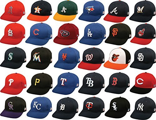
30. Tampa Bay Rays - Bad colors, bad design, bad font. Advertising for one of the top ten causes of death worldwide, also kind of a downer.
29. Cleveland Indians - Racism. Not cute.
28. Miami Marlins - While there are several caps that are worse, this ranks so low because it could have been so much better. The black kills the quite excellent logo / letter.
27. Toronto Blue Jays - Lose the Maple Leaf and it jumps fifteen spaces forward. Don’t layer logo on top of logo.
26. Colorado Rockies - Purple is - objectively - the best color, but this this is an interlocking letter mess, and the black doesn’t help.
25. New York Mets - I lied about the favorite team part. You broke my heart when I was six. Go to hell Mets, and take your urine-soaked town with you.
24. Arizona Diamondbacks - Hard to make a snake wearable.
23. Washington Nationals - Basically ripped off the entire Atlanta Braves cap, just replacing the letter.
22. Atlanta Braves - Not so good (not so bad, either) to be worth ripping off.
21. Texas Rangers - The red outline of the white “T” could be visually stronger - or eliminated entirely.
20. Seattle Mariners - Overlaying the compass logo on a letter is well-intended, but muddled.
19. San Diego Padres - Go back to brown / orange / yellow, jump up at least ten spots.
18. Milwaukee Brewers - The color is ok, the grain thing is ok, the font’s ok, but it reads as a Miller beer ad, and the alternate “mb” hat in the shape of a glove is so much more fun.
17. Philadelphia Phillies - Bright. Simple. But the two colors with the simple “P” isn’t very interesting. Not bad. Just not great.
16. Cincinnati Reds - Add one extra color to the Phillies cap and a more classic font for the letter, move up one space.
15. / 14. (tie) Pittsburgh Pirates, Kansas City Royals - They’re both simple. They’re both classic. Their colors both reflect the communities they represent (Kansas City’s fountains, Pittsburgh’s steel industry).
13. Los Angeles Angels of Anaheim - Pretty good for a logo / letter combo, except the confusion about just what city does this team represent.
12. Minnesota Twins - Twin Cities. Right there on the cap.
11. Houston Astros - Good, distinctive colors.
10. St. Louis Cardinals - The best / most interesting red hat.
9. San Francisco Giants - My second favorite national league team and one of the three great American cities, so much better than that smog pit down the coast. So it pains me to do this, but…
8. Los Angeles Dodgers - Bright blue color. Interlocking letters working together. Simple. Classic. Cheerful.
7. Boston Red Sox - The simple and classic theme, again. Plus, putting one of these on raises your presumed intelligence by double digits.
6. New York Yankees - Due respect.
5. Baltimore Orioles - The most fun standard home cap in the league.
4. Oakland A’s - The colors!
3. Chicago White Sox - Or, the lack thereof. Black. White. Simple. It’s like a tuxedo for your head.
2. Chicago Cubs - Bright blue. Simple red letter, outlined in white. It’s a piece of mid-century modern art, in all American colors, unchanged since 1958. You got your Lake Michigan and look up at these gorgeous buildings being muscled into the sky color reference. You have a font that is neither trying too hard nor too lackadaisical. You have a letter that works both for the name of the city and the team (and some lucky wearers with “C” names). You have a century of humility and hope and awe shucks, we’ll try again tomorrow. You have a happy go lucky reminder that, some day, this will all work out. I may be reading too much into this, but it’s a good piece of design.
1. Detroit Tigers - Just a perfect, under-stated, classic cap, and quantitatively better than the Yankees, because Detroit is an easier city to root for.
